Saturday, May 23, 2009

Covered memo pad with some product discussion

Pictured here is my latest little project--the product of the first time I've been able to sit down at my craft desk in nearly a week. It's a covered memo pad, just a cheap little top-bound flip pad I picked up in the clearance rack at JoAnn after Easter this year. You can see the pads pictured below at the left. They came two to a pack for $1.00.

I won't go into project details on this because I teach my method for covering and embellishing these books in a class and I can't give away my secrets on this one. However, I will talk about how I made the bird embellishment, and some of the products I used.

You can see the Ranger Inkssentials Glossy Accents bottle to the right of the memo pad. This is one of my favorite things! I've tried other clear coatings only to want to throw them away (Aleen's Paper Glaze, for instance) because they, well... SUCKED. Ranger hasn't ever disappointed me before, and they have proven themselves worthy of my love again in this product. I remember when I first started using the glazes on my papers and I could NEVER find any information as to how long they take to dry. Here it is: Everything on these products says something about drying times being effected by the thickness of the coating. Maybe this is true. However, it alwayst takes at LEAST an hour for these things to dry, and if you do more than a very thin coating, expect to wait at least two or three hours. Point being, don't expect to set it aside for twenty minutes while you're doing something else and come back to it in a bit.

Also, you will never cease to amaze yourself with all of the ways you will destroy the glaze coating while it's drying. Take it from me, you will NOT remember that it's drying in your area and that it's wet. Just set it somewhere high and out of the way for a few hours. You'll be glad you took the time to do so.

Okay, and one of my favorite uses of all for this: GLITTER embellishments!!!! I'm actually talking about one of my favorite kinds of pens, again, from Sakura, called Stardust pens. They write with a glittery look to them. You need to look for the cap that is clear with just a hint of glitter and a shooting star on the piece that comes down (whatever that's called). THOSE are Srardust. If you get a pen with a cap matching the color of the pen that is all glittery--that's NOT a Stardust pen.

I love to stamp images and color them in with the Stardust pens, and then cover the colored pieces with the Inkssentials Glossy Accents. Once it dries, you are left with a really popping glittery look that will lend some sparkle to your design without lending its sparkle to everything else your paper project comes in contact with. (Glitter has been called the "herpes of crafting supplies", and while I don't agree with the bad rap glitter gets for getting everywhere [I've been described, in a positive way, as having "glitter on my soul", because I leave sparkling traces of my presence everywhere I go], I know some people [glitterphobes!] don't like that.)

These stamps, too, are my newest favorite set, purchased for me by my awesome mother in law (thanks, Sumolo! [I wonder if anyone thinks that's your real name? LoL]) at JoAnn called "Gem Stone Birds", by Inkadinkadoo. This stamp set lends itself so perfectly to the coloring with Stardust pens and glazing projects I love to do because they have little jewel shapes built right into the designs. Once colored and glazed, they really look awesome!

I apologize for these crappy pictures, too. It's been gloriously rainy and cloudy for about three days here in the Phoenix area (I saw one of my Facebook friends say in her status that she was enjoying it, and said to a relative somewhere else where rain is common, I think, that "this is like sunshine to you there"... I couldn't agree more. It makes me want to stay outside all day when it's all pleasant and overcast like this!), so the lighting isn't the best, but I was sick of waiting to post again, so here goes. ^_~

Tuesday, May 19, 2009

Love 'em! (Some random product discussion)

I'm going to randomly gush about some of my favorite products, just because I feel like it. Now I'm in no way affiliated with any of these companies, and I don't get any commission from JoAnn for talking up any of their products, and not all of these things can be bought at JoAnn anyway. So here is a list of MUST HAVE products, just from the top of my head:

The first thing that comes to mind is the BasicGrey Rubon Tool. It's gray in color and has a roller ball at one end and black paddle shaped piece at the other end. It does SUCH a marvelous job of attaching rubons that this product is singlehandedly responsible for my current rubon obsession which is very great, indeed. They sell for about $6.99 each and I've found them locally at Scrapbooks, Etc. (Gilbert, AZ) and I've also seen them in Hobby Lobby.

Random Tip for Storing Rubons: I store mine standing up in a scrapbook file. If they get squished, the rubons can stick to the "non-stick" paper and come apart when you try to peel them away and get ruined. Don't ever stack anything on your rubons.

For rubber and clear stamping (mostly clear for me!), I absolutely ADORE almost any ink manufactured by Tsunkineko. VersaMark, VersaMagic, etc... I love, love, love the Versamagic Dewdrop inks. They're sold in packages of four at $9.99 each when they're not on sale, but they are often on sale when I go into JoAnn. JoAnn, as a rule, has a much better selection of colors than Michael's, and I'm not just saying that because I teach there. I particularly adore the set marked "Jewel Box". It comes with Perfect Plumeria (a rich, deep red color), Purple Hydrangea (an absolutely beautiful darker purple color), Spanish Olive (a warm, dark green), and Aegean Blue (a glorious sapphire blue color). The card at the left of my banner on the top of this page was made with the red, blue, and green from this set. I LOVE those colors!

For glue, I don't think you can beat the Scotch Quick Dry Adhesive. This glue creates a nearly instant bond from paper to paper (you have a few seconds to work with it, or reposition, but seriously... only a FEW), and will securely hold buttons and acrylic jewels and other little attachments to your paper crafting pieces. Probably my favorite thing about this glue is that it has a cap that will support the glue when it's turned upside down. I like to just use the cap like a little docking station. I glue what I need and set the glue upside down in the cap, not even screwing it back on. I get to go through my entire project that way very quickly!

I may come up with more products later, but those are the three that popped into my head today. I'm going to get a project together and photograph it using two of my other favorite products which I can't just tell anyone about--I have to show them off!!!

Thursday, May 14, 2009

Clear Stamps Video

Here's a little video I put together on how to work with clear stamps. Hopefully you'll find it useful even though it's not the clearest thing in the world. My camera is very old and it was cheap when I got it! LoL. But the information is good!

Tuesday, May 12, 2009

New Embellishment Project/Color Thoughts

Mother's Day weekend has come and gone, and life is getting back to normal around here. My kids are blessed to have so many people to celebrate Mother's Day for, including a Great-great grandmother!

I'm hosting a Paper Party at my house this Friday night. I set out my tools and supplies and allow people to make whatever they want to for a while. People really love coming, and I really love getting things together for the party. This is one of the ideas I was playing with as a little inclusion in the gift baggie everyone will get. It turned out so cute, I had to share it on here.

Making your own embellishments not only saves you money and time (YES, time, because you're not going to the store and you're not shopping for hours and agonizing over which embellishments to buy because you have to stay within your budget and you can't get them all!) in your own paper crafting, it can help you in giving gifts to your good friends who are also paper crafters. I love to give my handmade embellishments as presents, knowing that it's something my friends will USE. And since paper crafters often give their own creations away, your present is like a double present--one for your friend, and one for whoever gets it placed on a gift from your friend. Awesome!

Anyway, in making these, and getting ready to post, I was reminded of what my students often ask. How do I pick colors? Well, I'm not a genius, I can tell you that. But I am aware. I look through things I LOVE and when I do love them, I take time to pick apart the colors that are present in what I love, and then I use those combinations in my work. For instance, color inspiration (dark blue, orange, red, and white) for this little project came from BasicGrey's Marrakech collection. To view this and other completely awesome collections from BasicGrey, go to www.basicgrey.com.

To do this same embellishment, you need the things pictured below.

Two paper punches, one larger and one smaller (or just use two punches that are the same size... really, play with what you have!)
VersaMagic DewDrops in Night Sky and Pumpkin Spice (I believe they come together in a set)
Sakura Glaze Pens, dark blue and orange (they came in a set together)
Red Marker
Flashy Floral Clear Stamp set from Inkadinkadoo! (My favorite set right now!)
White cardstock
Glue
Center embellishment: I'm using a dark blue button from a bag of tiny buttons I bought at JoAnn. (The last time I shopped for buttons there, I was pleasantly surprised at all of the new, cute colors I saw in the cheap bags of buttons. They used to only have a few, and now there are a lot more!)
1/16" thick dimensional adhesive... this is to keep the bulk of your embellishment down, and also because every store-made layered embellishment I've seen uses 1/16" and NOT 1/8". You need to look and make sure that it's thinner, or make sure the package says that it's 1/16", because most of the foam adhesive out there is 1/8". If you can't find tiny circles of it, just cut the pieces until they're small enough to fit under your chosen punch.


1. Punch your pieces out of white cardstock, or whichever color you choose.

2. On a piece of scrap paper, trace around the outside of the punched pieces with your marker. This will leave an inked edge look. Don't worry about it being perfect. I obviously didn't. (Look at the large flower.) It will blend in later. (This is the super awesome way of doing this that I stumbled upon just for making this embellishment, and I seriously cannot hide my excitement over the fact that I now have a superbly easy way for making the inked edge look on my punched and cut pieces!!!!!!)

3. Using Night Sky ink and the Pineapple stamp from the Flashy Floral set, stamp the larger flower. Ink a smaller portion of the stamp and stamp again to get any areas left white during your first pass. Clean the stamp (I use baby wipes) and let it dry. Ink a small portion of the stamp (enough to cover the smaller flower--you don't need to ink the whole stamp every time!) and stamp over the smaller flower. Clean the stamp and let it dry before you put it away.

4. Go through with your glaze pens and draw in some of the patterns left by the stamp. Use dark blue on the dark blue and orange on the orange. This is not an exact science--aim to color about 50% of the outer petals. If using the Sakura glaze pens, make sure you don't put ink in the middle of either flower (it will get covered up anyway, but could also interfere with some adhesives). I love the Sakura pens because they leave a slightly raised sheen that makes these embellishments look less handmade. You could skip this step entirely if you want to.

5. Using your Sakura pen, or another similar sized gel pen, shape the petals of your flowers. Place the pen in the center of a petal and curl the petal around the shaft of the pen. Repeat for all petals. On the smaller flower, do this same thing, but you may want to squeeze the petals slightly when you finish to give it more of a defined look. Just don't squeeze hard enough to leave a big crease.

6. Attach the top piece to the bottom using the 1/16" dimensional adhesive. You can eyeball it, but to dramatically increase your chances of doing this well the first time, use this little trick: peel only one side of the foam adhesive away and stick it to the back of the TOP piece. With the bottom part of the adhesive still covered, center the top piece where you would like it to be on the bottom piece. Look at it. Pick up the smaller piece and peel the adhesive cover away, THEN carefully place the top piece onto the bottom piece. I don't know why it works, but this is what I show my students, and every single one of them has more success when they do it this way. It's like your brain remembers where it's supposed to be and puts it there. Pretty neat!

7. Glue or attach your chosen embellishment to the middle. I thought this look just begged for a button instead of a jewel, so I used a tiny button that I bought at JoAnn.
All of the supplies for this project can be purchased at JoAnn except for the smaller flower punch. Hey, I don't get any commission off of my sales (I WISH I did, because I'd make some serious cash that way), I just say what I love, and I shop there all the time because I teach there. Hope this was helpful! Remember, check out colors around you and remember what you love, then include it in your projects.

OH, YES! To give these as gifts, I like to place small photo squares on the backs (if the punch is large enough). I just don't peel the adhesive cover off. When the lucky recipient of my embellishments receives them, they can the peel the cover and use the embellishment just like a sticker. If your embellishment won't work for this, just let the person know they can use a good paper glue like my fave, Scotch Quick-Dry Adhesive which is not just my fave because it glues really well and REALLY fast (the bond is almost instant between two pieces of paper), but the cap is made so that you can store the glue upside down. LOVE it!

Saturday, May 9, 2009

May Card Exchange Card/Thoughts on Embellishment

This is how I used the embellishment I did the demo for a couple of days ago. It's the card for my May card exchange. The paper is from BasicGrey, which I love, of course.

I also did a bit of doodling on the card front--something I never used to do, but seem to do more and more with each new design. A quick way to bring continuity to any card design is to trace the outer edges of the paper with a pen, the way I've done here. I know that I have to have seen it at least 100 times before it finally dawned on me it was there--it's amazing how it really does seem to bring everything together, and it's one of those extra touches, like inking edges, that you probably don't even notice, except to miss it when it's not there.


Hopefully people like it! I love to incorporate my handmade accents, especially the complex ones, in such a way that they're not necessarily center stage. I believe it helps accomplish even more the sense that it was something I purchased rather than something I made. Too often, I think, we make beautifully complex things and because they took a while, we want them to take center stage. Maybe the next time you do something like that, try making it just a supporting element rather than the main focus. Later on, when someone invariably says they loved the accent you put on the card, you can say you made it, and let them gasp and stare at it with new appreciation. ^_~

Friday, May 8, 2009

Free Digital Scrapbooking Paper

Digital scrapbooking is possibly one of the most cost-effective ways of preserving your memories. Searching around on the web, you can find several awesome free downloads for doing your own pages. My favorite site with (I think) the best free downloads is Shabby Princess:

www.shabbyprincess.com

Here's a little page I made in my pathetic Adobe Photoshop Elements 2.0 program. Yes, you read that right. 2.0! I can't wait to get a newer version! It's a .jpeg image formatted to be 12x12 inches at 300 dpi. To lift this image, just right click it and click on the "save image as", then save it. Use it in PhotoShop or whatever other image editing software you have to create your own designs.

If you do take it, let me know! Feel free to use this for any of your digital scrapping needs. If you ever do use it in something or submit it to a magazine or whatever, I'd love for you to credit my blog. Otherwise, feel free to use it however you want, even as part of your designs to sell, if you do that.

Thursday, May 7, 2009

Sakura Glaze Pens and Stamping Fun!

I'm about to share something with you that is probably my most monumental thrill since starting to work with Martha Stewart craft glitters. And, oddly enough, unlike most of my past obsessions, it comes not in the form of product or tools, or really anything you can buy. My most recent artistic lover is the color combination: turquoise and red.

Turquoise and red were made for one another. I adore mixing cool and warm colors anyway, even though a lot of people say not to (gray and orange, for instance--a BEAUTIFUL look!). I think that part of what makes this combo work is the fact that Turquoise itself is a warm blue. And I love the look of turquoise with an especially warm and somewhat dark red. They just match!

With that in mind, I was in the process of deciding what I was making for my card exchange this month. I knew that turquoise and red had to be a part (I had just finished making five Mother's Day cards with this color combination front and center) and was absolutely thrilled to stumble upon this idea that I'm about to share with you.

Great artists aren't those who have the best ideas--they're those who have the best accidents.

(That was pretty close to brilliant, if I do say so myself.)

Supplies needed to create this exact awesomely cute embellishment are as follows:

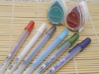
VersaMagic DewDrop Chalk Inks in Turquoise Gem and Red Brick (they come in the same set--so smart!)--first picture
Sakura Glaze Pens (these are relatively new on the market, I think, and I absolutely love their fun look--the pens pictured here all come in a set--I used every color except the white and the dark blue)--first picture
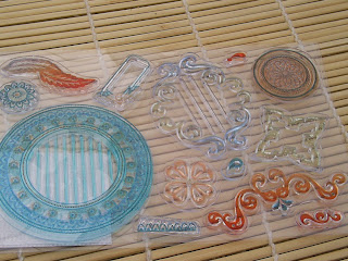
Casablanca Clear Stamp set from BasicGrey (I LOVE BasicGrey!!!!!)--second picture
White cardstock cut into circles--2.75", 1.5", and 1.25", one of each for each embellishment. I used my Cricut machine to cut the circles, but alternatively, you could use punches, or just cut with scissors around your stamped images. I'll explain more in a bit about this because of one of the steps, so keep reading!


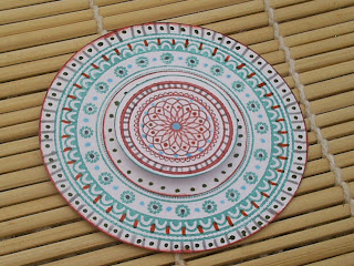
Okay, so this is what we're actually making:It's so much easier than it looks! Seriously, step by step... it's not that hard. And, yes you can do it. Yes you can. Don't argue!


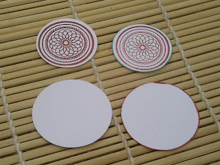
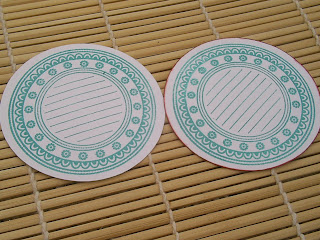
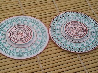
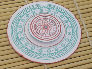
Stamp your images as follows: the stamp shown above on the 1.25" circle in Red Brick. The stamp shown below on the 2.75" circle in Turquoise gem. Leave the 1.5" circle blank. Once stamping is complete, ink the edges of each piece as follows: 1.25" circle with Turquoise Gem, 1.5" circle with Red Brick, 2.75" circle with Red Brick. (The first circle in each image is without the inked edge, the second circle pictured shows the edges inked.)

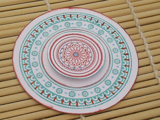
Once you've completed the above step, assemble the piece as pictured below at left, and as described: Adhere the 1.5" circle to the center of the stamped image on the 2.75" circle, covering the lines. Adhere the stamped 1.25" circle to the center of the two circles with foam tape or other dimensional adhesive.

About the circles: You don't have to have some fancy machine or punches or whatever to make this embellishment. You can do it with scissors! Simply stamp the two images in the colors listed above and cut around them, leaving a bit of border all around. Please don't be crazy about trying to make it super perfect. "Perfect" is what it's called when you can make something without beating yourself up about how it looks the whole time. Consider the first one practice, okay?

Now, to cover the lines... Either you can try really hard not to get ink on them as you stamp (which is easier said than done in many cases), or you can do a technique called masking. You won't get the inner ring of Red Brick around the circle in the center of the larger design, but it's fine. Stamp the larger image on a paper. Cut out the center lines, discard the rest of the stamped image. Lay it down on your cardstock. Stamp over the piece of paper, making sure it's centered under the lines of the stamp (with clear stamps, you can do this!). Pick it up, peeling the extra paper away from the stamp itself if necessary. You've just blocked the inked lines from being stamped! Look how clever you are! Now you can move on to coloring the embellishment, which is, I think, the funnest part!

You need to be careful when using the glaze pens. Don't touch what you color/draw until the ink is absolutely dry, or you'll mess up the glaze effect. This is the main reason I work from the center out. If necessary, allow each color to dry before moving on to the next color.

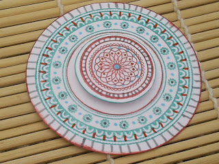
Using the light blue pen, color in the center of the smaller stamped image and place dots along the outer edge of the intricate inner decoration, as shown. Place dots in between the flowers inside the ring on the larger stamp, as shown.

Using orange, color dots inside the intricate scroll work of the central piece, as shown. Draw lines coming out from in between the arches on the larger stamp, as shown.
Using the gray pen, color in small lines in between two of the rings on the smaller, center circle. It can be somewhat hard to do this one since you're coloring against the air, but you'll get through. The pens flow quite nicely! Color dots on the centers of the flowers on the larger stamp. Now color lines all along the outside edge of the larger stamp. Be careful to handle only the edges of the piece as you're turning so that you don't mess up the glaze before it sets--alternatively, you could let the lines on the middle circle dry and then use that to turn the embellishment as you color.

Now, using the green pen, color dots on the inner circle piece, all around the smaller stamped image. Color dots in between the gray lines you drew in the last step, again, being careful not to smudge any of the wet glaze ink. Now you're ready to attach your awesome embellishment to the front of a card, or for use in your scrapbook, or whatever!

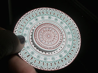
Look at how fun the glaze pens look in the light. They shimmer a bit, and really add that "I so bought this instead of made it" look to your crafts which, I must admit, is what I'm usually going for.
Even if you don't have these exact supplies and won't create this exact project, I encourage you to experiment with stuff like this--working a tiny bit at a time to create something that looks complicated!

Wednesday, May 6, 2009

Maiden Voyage

I'm a teacher at a local JoAnn store, and it's my absolute passion to share techniques and fun ideas with my students! This blog is meant to be an extension to those activities, and to anyone else on the web who may be interested in seeing some fresh content.

I'm an all over the place scrapper, a dabbler in nearly any technique I hear about, which makes me something of a wellspring of information. Not that I'm any kind of paper crafting guru--those people get in the magazines. I just look forward to helping anyone, if I can.

If you appreciate any of my posts, please leave comments. After all, comments are what keep a blogger going. No one wants to type into empty space.